


Project Objective and Challenges
🤔 The main task:
To develop an engaging and functional landing page for a business coach, aimed at effectively presenting the personality and services clearly for visitors.
🙆 Project Challenges:
The key challenge in the development process was organizing the client's services, because there was a lot of missing or vaguely defined aspects in the brief.
🤩 Approach to Solution:
Our team focused on creating a clear and logical structure for the landing page, reflecting the uniqueness and professionalism of our client. Special attention was paid to details, to design not just a site that meets all technical requirements but also emotionally resonates with the target audience.

🖌️ Design Process and Decisions
Upon our initial engagement with the client, we understood her values, and the essence of coaching practice. This foundational step was crucial in aligning our design direction with the client's identity and service offerings.
🌈 Color Scheme and Aesthetic Choices:
Through our conversations, we identified color preferences that resonated with the client's brand. These colors were employed as accent tones throughout the design.
Our competitive analysis revealed a gap in the market regarding stylistic and representational quality. This insight led us to prioritize style, contrast, and typography, ensuring the design stood out in a crowded marketplace.

✨ Design Variants:
We proposed two design concepts to the client:
Retro-Inspired Design:
Featuring warm, paper-like textures, large typography, and a free-flowing layout, this design variant aimed to evoke a sense of nostalgia and warmth. The accent colors complemented the chosen craft paper hue beautifully, creating an inviting atmosphere reminiscent of a newspaper or magazine.
Modern Style:
This design took a bold, contemporary approach, utilizing the client's primary color against a deep black background for dramatic contrast. Geometric shapes represented the complexity and nuance of the coaching industry, while large fonts highlighted key information blocks. Client materials were subtly edited to incorporate the accent color, ensuring visual harmony and minimizing color distraction (e.g., changing a beige skirt in a photo to our corporate color).

📣 Client Feedback:
The client was particularly drawn to the modern style, appreciating its boldness and clarity. We refined the design further, focusing on enhancing usability and visual impact. Adjustments were made to several blocks, addressing feedback and improving the overall user experience.

🔤 Fonts:
For this project, the Ubuntu font was selected as the primary typeface, a decision driven by several key factors that align with our design objectives and the client's brand identity.
💼 Advantages of Ubuntu Font:
1. Readability: Ubuntu is designed for clarity on both screen and print, making it an excellent choice for digital platforms. Its easily distinguishable letters ensure that content is accessible to a wide audience, including those with visual impairments.
2. Versatility: With its range of weights and styles, Ubuntu offers great flexibility in design. This allows for a dynamic hierarchy of information, critical for a website where conveying different levels of information clearly is essential.
3. Modern Aesthetic: The font's modern and clean aesthetic enhances the contemporary style of the website, aligning with the client's innovative approach to coaching. It contributes to a professional yet approachable look and feel, which is crucial for establishing trust and credibility with potential clients.
4. Open Source: As an open-source font, Ubuntu embodies a spirit of community and collaboration, resonating with the client's values of openness and shared growth.
5. Cultural Fit: The Ubuntu font, with its name derived from the African philosophy of 'humanity towards others', subtly reinforces the client's commitment to personal connection and collective betterment. It's a nuanced touch that adds depth to the brand's narrative.

🎯 Our solution
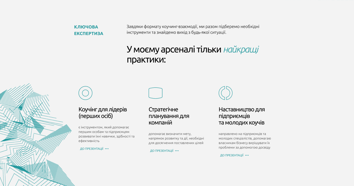
The final design shown below is a stylish and professional landing page for Sofia Biletskaya, a business coach. The design is executed in a concise and modern aesthetic, using a monochrome color palette with aquamarine accents that convey a sense of trust and reliability. The layout is organized in a way that clearly and effectively presents Sofia's expertise and services. Large, bold fonts draw attention and guide visitors to key information.
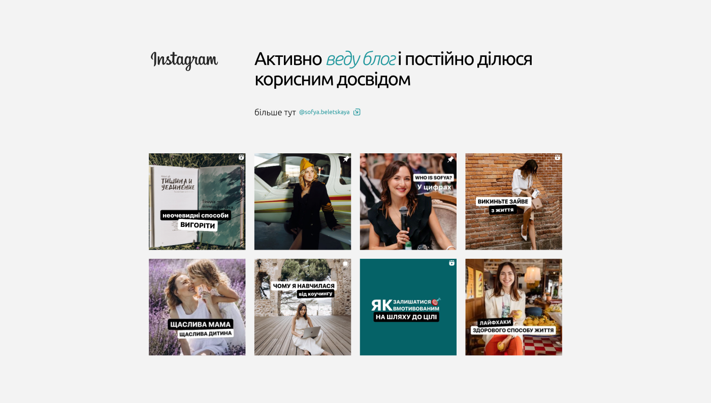
The use of high-quality images adds a personal touch, connecting visitors with Sofia's professional image. Services are neatly categorized for easy navigation, and the brief text conveys Sofia's mission to help business owners achieve their goals, increase profitability, and strengthen relationships with clients. The design successfully combines style and substance, providing an attractive user experience while positioning Sofia as a knowledgeable and accessible industry expert.


📱 Optimization for mobile devices
🔍 Testing and improvement:
The key focus is on the mobile version of the site, ensuring it works perfectly on different devices. Our developers have conducted extensive testing on multiple mobile platforms, from smartphones to tablets, to ensure error-free display and functionality.
🎨 Responsive design, flexibility and automation:
The entire layout was carefully built on autolayouts, which allowed us to achieve maximum adaptability and responsiveness of the interface. The adaptation of the design for mobile devices included the reworking of text blocks, images and navigation elements for their optimal use on touch screens.
📐 Responsiveness in every pixel:
The application of responsive design principles ensured that the site scaled perfectly for any screen resolution, while maintaining high visual quality and user experience.
🌐 Availability and convenience:
The result of our efforts is a site that demonstrates smooth operation, interactivity and visual appeal with clear navigation and readability, making it convenient and accessible for all users, regardless of their device preferences.

🚀 We invite you to consider the project in more detail at the following links:


